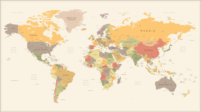
Many people look at maps every day. Some people may be searching for traveling routes, others may be planning how to deliver their shipment. For those using localized maps, you are probably safe from the discovery that has left many reeling but if you are the sort to pull up a world map, you might want to consider getting the new one.
What’s new on the World Map?
As of last week, Boston public schools started using the new world map. The map was distributed to all public elementary, middle and high schools in the district, going the second, seventh and eleventh-grade teachers to put up in their classes.
So why the change of maps?
For a long time, atlases, textbooks, and even the internet have been using what geographers call the Mercator projection map. This map was assembled by the famous Flemish cartographer Gerard Mercator in 1569.
Speaking to Boston’s WBUR, Hayden Frederick-Clarke, director of cultural proficiency for Boston’s public schools, remarked that the Mercator projection depicts certain regions of the world as ‘smaller’ or ‘more insignificant’ than they actually are. In summary, Mercator map is a tad inaccurate because his map is ‘Eurocentric’.
In the Mercator projection map, Europe is placed at the center of the map and appears larger than Africa and South America. North America also looks bigger than it actually is, while areas like Greenland have been represented by fourteen times their actual size. The Southern Hemisphere, which in actuality is twice the size of the Northern Hemisphere, looks almost equal to the latter zone. These misrepresentations are thought to be because Mercator designed the map to avoid colonial trade routes, and are what the new map seeks to correct.
A little background on the ‘new’ map Boston public schools has started using. The map said to be created in 1974 by German historian Arno Peters, is quite controversial. A similar map was found later, owing its creation to the nineteenth-century Scottish geographer James Gall. Since none could verify who did create it, the map ended up being called the Gall-Peters projection of the world.
The Gall-Peters projection map cuts down continents to their actual size. Though it does not have the colonial bias Mercator had in creating his map, the Gall-Peters projection is also far from perfect. The new map projection also warps landscape features because one thing is for sure, it is hard to portray a round piece of land on a flat surface without some adjustments.
Effect of this new Map on the World’s Perspectives
When the Gall-Peters projection map was introduced in Boston schools last week, Natacha Scott, the Director of History and Social Studies for Boston Public Schools, explained the student’s amazement. “It gave them a different view of what they thought they knew.”
Frederick-Clarke added that it gave their majority-coloured student population some comfort to learn that they did not come from ‘small’ continents, sort of a decolonization measure. With the coming of the Gall-Peters world map projection come to the news that the world is much more different than you would have previously thought.


